Responsive Website Design
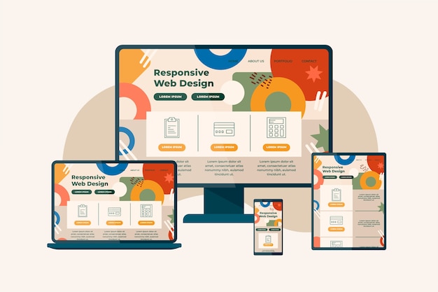
Responsive Web Design
At Concern Infotech, we craft responsive websites that adapt seamlessly to all screen sizes—desktops, tablets, and smartphones. Our mobile-first design approach ensures smooth navigation, fast loading, and an enhanced user experience across devices. Whether your audience browses from a phone or a PC, your website will look great and perform even better.
Responsive design is not just about aesthetics—it improves SEO, reduces bounce rates, and increases engagement. By ensuring your website functions flawlessly on any device, we help you reach a wider audience and boost your online presence effectively.
Advantages of Our Responsive Website
At Concern Infotech, our responsive web design services ensure your website adapts seamlessly across all devices—desktops, tablets, and smartphones. With the growing number of mobile users, having a responsive site significantly improves accessibility, helping you reach a wider audience.
Search engines like Google prioritize mobile-friendly websites, so responsive design also boosts your search engine rankings, increasing your online visibility.
A responsive website offers a smoother, faster, and more intuitive browsing experience, which leads to higher user satisfaction and improved conversion rates.

Real Stories, Real Success
5.0
50+ Review
"Success Stories from Visionary Founders"
